
This post is a report for MGIS 650, summarizing how to visualize cancer trends in Tableau for Rochester Regional Health.
Dear Rochester Regional Health (RRH),
This guide summarizes how I created analytics and visualizations to explore cancer incidence in America and New York State. I hope that through this guide, RRH may easily duplicate and modify this work to fit its needs later. Please contact me if RRH would like any immediate changes. To complete this project, I used the provided sample datasets, but these steps can be followed with any dataset with the same structure as the sample dataset.
My goals were as follows:
- Which regions of the country are most prone to cancer?
- How do the factors affecting cancer vary by region?
- Focusing on New York State, which factors are important? What should health professionals focus on to combat them? How should RRH proceed from a business perspective?
In each section, I will cover how I completed each task’s requirements, and the challenges I faced in the process.
🌸👋🏻 Join 10,000+ followers! Let’s take this to your inbox. You’ll receive occasional emails about whatever’s on my mind—offensive security, open source, boats, reversing, software freedom, you get the idea.
Data Overview
First, I explored the data to see if it needed to be cleaned. Here, I loaded RRH’s data to observe the structure of the data.
- Rows: 32,551
- Columns: 18
Initial Observations
RHH’s dataset includes cancer incidence and death rates, population estimates, poverty levels, and median income by ZIP code. This information will help analyze regional patterns and socioeconomic influences on cancer incidence.
incidenceRateanddeathRatedisplay the cancer incidences and effects.recentTrend,fiveYearTrend, andrecTrendoffer insights on cancer trends, which help identify regions with increasing or decreasing rates.
Data Quality Inspection
Next, I checked for missing values, data types, and potential outliers using a basic Python program.
Here, I could determine that there are no missing values in the dataset, which is excellent. This meant I could proceed with the analysis directly without imputation or data cleaning.
Basic Statistical Analysis
Then, I examined distribution plots for some of the numeric columns (e.g., incidenceRate, deathRate, povertyPercent) to understand trends. Using Python, I generated visualizations for these columns.
The results of this program are as follows.
🌸👋🏻 Join 10,000+ followers! Let’s take this to your inbox. You’ll receive occasional emails about whatever’s on my mind—offensive security, open source, boats, reversing, software freedom, you get the idea.
Incidence Rate

The distribution is roughly centered around the average, with a few areas showing notably higher rates.
Death Rate

Similar to incidence rate, with most data clustered around the mean, but a tail of higher rates indicates some regions experience higher mortality.
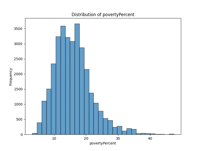
Poverty Percent

This chart shows a skew toward lower poverty levels, but there are regions with significantly higher poverty rates.
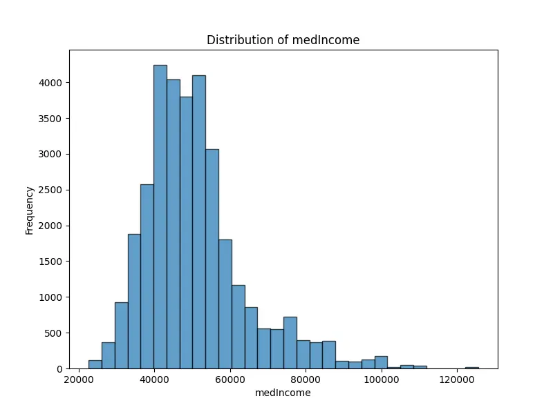
Median Income

The majority fall in the lower to mid-income range, with fewer high-income regions, indicating a skewed distribution.
Geographic Analysis
Outside of this basic analysis, I needed more sophisticated software to handle data manipulation, analysis, and visualization. To do this, I used Tableau.
Tableau is known for its data visualization, and it is particularly effective for creating interactive dashboards and geographic maps (such as cancer incidence by ZIP code). It is also great for drag-and-drop analytics and interactive visualizations.
In short, it will allow me to create clean, professional-looking dashboards with filters, hover-over details, and drill-downs—perfect for non-technical users. The downside of Tableau is that it is costly. To complete this project, I had to use a free trial of Tableau because I could not afford to pay for it.
General analysis: Which regions of the country are most prone to cancer?
This section seeks to answer objective 1: which regions of the country are most prone to cancer?
To do this, I will open Tableau, and import the dataset cancerdeaths1.csv. Once I successfully imported the data, I dragged State onto the map to create a geographical view. In Tableau, this view is known as a “sheet,” and I will be helping RRH explore the cancer data through these sheets.
The dataset contains columns such as State, incidenceRate (rate of new cancer cases), deathRate (rate of cancer deaths), and population-related data (popEst2015). To identify regions in the USA that are most prone to cancer, I focused on the incidenceRate and deathRate across different states.
🌸👋🏻 Join 10,000+ followers! Let’s take this to your inbox. You’ll receive occasional emails about whatever’s on my mind—offensive security, open source, boats, reversing, software freedom, you get the idea.
Sheets
I created two sheets: one focused on incidenceRate and another on deathRate. In each sheet, I placed incidenceRate and deathRate as color-coded measures on their respective maps. To do this, I dragged incidenceRate and deathRate over the color mark in each tab. Here, the color gradients represent higher rates with more intense colors.
Within both sheets, I used tooltips to make them more comprehensive. In Tableau, a tooltip is a pop-up box that appears when I hover over a data point, displaying additional information about that specific point based on the fields I add.
The tooltip information includes avgAnnCount, avgDeathsPerYear, and popEst2015 in the tooltip for additional context.
Lastly, I added filters to each sheet for State, incidenceRate, and deathRate to allow interactive exploration. In Tableau, filters allow me to refine and display specific data subsets in a visualization based on my criteria. The filters I selected enable RRH to explore the cancer data by narrowing down specific states, and adjusting ranges for cancer incidence and death rates, making it easier to identify regions with higher cancer prevalence and mortality for targeted analysis.
Overall, this setup will let RRH visually identify regions with the highest cancer incidence and death rates in the USA.


The charts above show the average cancer incidence and death rates by state. This view allows RRH to quickly identify states with higher incidence rates, which could be areas of interest for further investigation.
From these graphs, we can see that the states with the highest incident rates are New York, Pennsylvania, Texas, and California, while the states with the highest death rates are Texas, Pennsylvania, New York, and California.
These graphs are located under the same headers in the Tableau workbook attached.
Factor analysis: How do the factors affecting cancer vary by region?
By digging a bit deeper, I can also use this information to help form views of the second objective: how do the factors affecting cancer vary by region?
I already have maps of cancer incidence and death rates by state. Thus, I will duplicate these sheets, and explore potentially correlated factors like poverty percentage and median income with cancer incidence and cancer death rate.
Through these sheets, you can see the poverty percentage and median income with cancer incidence and cancer death rate, and filter using the scales within each sheet.
🌸👋🏻 Join 10,000+ followers! Let’s take this to your inbox. You’ll receive occasional emails about whatever’s on my mind—offensive security, open source, boats, reversing, software freedom, you get the idea.


Map Insights
Poverty and income affect cancer outcomes, particularly in mortality. This could highlight socioeconomic barriers to healthcare access or differences in healthcare quality.
On the other hand, cancer incidence has a weaker correlation with poverty and median income, suggesting that other factors may influence cancer occurrence more directly.
Scatter Plot Insights
I also thought a scatter plot would be an interesting way to display this data. I began by creating a scatter plot for each factor to analyze potential relationships. To explore how cancer incidence may be related to external variables, I created separate scatter plots for each factor. I dragged cancer incidence to the Rows section and the chosen socioeconomic factor, such as poverty percentage or median income, to Columns. Make sure the Marks card is set to display data points, typically represented by circles. Then, I added a Trend Line by right-clicking on the plot and selecting “Trend Lines” > “Show Trend Lines” to gain a visual impression of the correlation.
The plot below shows states cancer incidence rates by their poverty percentages.

Proof
Additionally, I performed a simple correlation analysis as proof using Python.
The correlation analysis reveals a moderate positive correlation (0.44) between cancer incidence and death rates, suggesting that regions with higher cancer incidence also tend to experience higher mortality rates. Similarly, a moderate positive correlation (0.44) exists between cancer death rates and poverty percentages, indicating that areas with higher poverty levels are more likely to have elevated cancer mortality. In contrast, there is a moderate negative correlation (-0.48) between cancer death rates and median income, implying that wealthier areas tend to experience lower cancer mortality. Additionally, as expected, a strong negative correlation (-0.77) is observed between poverty percentages and median income, with lower-income regions generally exhibiting higher poverty rates.
New York Analysis
Important factors
Then, I focused on the third question: Which factors are important in New York State?
I used ZIP code data to visualize incidence and death rates in New York. Here, I created a map visualization by dragging zipCode to Detail under the Marks card. Then, I placed incidenceRate and deathRate on Color or Size to visualize these rates by ZIP code. To filter for only ZIP codes in New York State, I dragged the State field to the Filters shelf, and selected “NY” to remove all other states.
Then, I added filters to each sheet to display how median income, poverty percentage, incident rate, and death rate are distributed and impact each region. Here is a brief overview of the charts, noting that these charts do not show the exploratory power of the sheet on Tableau.
🌸👋🏻 Join 10,000+ followers! Let’s take this to your inbox. You’ll receive occasional emails about whatever’s on my mind—offensive security, open source, boats, reversing, software freedom, you get the idea.


Proof
I can also generate summaries for this data using Python.
The summary for New York data reveals that the incidence rate ranges from 435.2 to 577.4, with an average of approximately 497.5. The death rate spans from 138.8 to 198.4, averaging around 169, which indicates variability across ZIP codes. Socioeconomic factors show the poverty rate ranging from 6.3% to 31.5%, and median income varying widely between $33,687 and $98,312.
Dashboards

The last step of this project was to create dashboards. In Tableau, dashboards are a way to present and analyze data by combining multiple visualizations, reports, and interactive elements on a single screen. They allow me to pull together different data views, such as charts, graphs, and maps, to create a comprehensive overview of the data for easier exploration.
The dashboard I created for RRH offers an overview of cancer incidence and mortality trends across the United States, and another with a focused analysis on New York State. By integrating key socioeconomic indicators like poverty rates and median income alongside cancer incidence and death rates, the dashboard enables RRH to identify regions with higher cancer prevalence and to examine how socioeconomic factors influence cancer outcomes.

The New York-focused section equips health professionals with localized cancer trends, helping RRH prioritize intervention areas and allocate resources more effectively. For business stakeholders, this dashboard uncovers potential service gaps and areas where RRH can expand its outreach or support, aligning operational strategies with community health needs. The dashboard’s design ensures that information is easily interpretable by non-technical users, supporting informed decision-making across departments.
What should health professionals focus on to combat factors affecting cancer incidence and death rate?
That being said, the incidence and death rates provide valuable insights into the spread and impact of cases across different locations. The incidence rate by state and ZIP code illustrates the number of cases per unit population in various areas, helping to identify regions with higher or lower occurrence rates. Meanwhile, the death rate by state and ZIP code indicates the mortality rate in these areas, often analyzed alongside demographic or socioeconomic factors to offer a more detailed understanding of the populations most affected.
🌸👋🏻 Join 10,000+ followers! Let’s take this to your inbox. You’ll receive occasional emails about whatever’s on my mind—offensive security, open source, boats, reversing, software freedom, you get the idea.
How should RRH proceed from a business perspective?
RRH can benefit from targeted data analysis. First, by identifying areas with high incidence or death rates, RRH should allocate resources more effectively, focusing efforts on at-risk ZIP codes. Additionally, insights into high-poverty or low-income areas with higher mortality rates can guide RRH’s preventive health campaigns and outreach programs, promoting proactive health management. This information also supports RRH’s healthcare policy and funding initiatives, as understanding correlations between income levels and health outcomes strengthens applications for funding or policy changes to improve care in underserved communities. Finally, by tracking these metrics over time, RRH can monitor trends and respond promptly to emerging public health challenges, tailoring interventions to specific communities as needs progress.
The poverty and income data section includes two key metrics: the poverty percentage, which indicates the poverty level in an area and may correlate with health outcomes like cancer incidence and mortality, and median income, providing income data to help identify socioeconomic health disparities.
The additional demographics and statistics section focuses on average annual deaths, offering insights into the number of yearly deaths, potentially segmented by location or demographic factors.
Lastly, the Interactive Filters feature allows for targeted analysis through State and ZIP Code Selection, enabling users to filter data by specific states (such as New York) and down to individual ZIP codes. It also includes filters for poverty percent and income level, allowing for the exploration of health metrics within different income or poverty brackets.
Final notes and challenges
In conclusion, this guide provides a framework for analyzing and visualizing cancer incidence data. By following the outlined steps, RRH can replicate and customize the analysis as needed, ensuring the flexibility to adapt to new data requirements. I want to support RRH in addressing cancer prevention and management from healthcare and business perspectives. To help combat the learning curve of Tableau, I am available for any immediate adjustments or to answer further questions as RRH begins applying this guide.


You must be logged in to post a comment.